

Overview
Navigating NYC's vibrant art scene is challenging. Access to reliable information is scattered, hindering art exploration and appreciation. Enthusiasts also often miss out on promotions and hidden gems that could enhance their experiences.
Role: UX Designer & Researcher (solo)
Duration: 3 months (Feb - Apr, 2023)
Outcome
I designed a comprehensive art guide for discovering and exploring museums, workshops, exhibitions, and street art in NYC. The app features a map for easy navigation, curated blogs to stay informed, and insider tips!
Following the Double Diamond design process, I made a sitemap, low & mid-fidelity wireframes, a style guide, and a high-fidelity designs.
Tools: Figma, Miro, Google Forms
Discovery
User Research
I conducted a survey to gather insights from 20 art enthusiasts (potential users). The survey aimed to understand their challenges and needs when finding and exploring art-related experiences in NYC.
People are often overwhelmed by the number of art-related events in NYC and seek an easy way to discover and navigate through them.
Budget considerations play a big role and any information about discounts, promotions, and free entry days is valuable to them.
People want to filter events by location, date, type, and their art-related knowledge level, based on availability and preferences.
There is a strong interest to learn about the history and cultural significance behind the artwork they encounter.
While people rely on social media platforms for information about art related events, important details often get lost while scrolling, highlighting the need for more focused and organized information source.
Define
How Might We
Given these findings, how might we design a mobile app that makes it easy for users to discover and stay informed about the latest and greatest art experiences in NYC, while also offering curated content, personalized updates, and insider tips?
Site Map
I then defined the content categories and outlined the app's structure to visualize the navigation flow.
Develop
Low & Mid-Fidelity Wireframes
With the structure in place, I began the initial stages of design by starting with rough sketches on paper, followed by creating digital versions using Figma.

Style Guide
Next, I worked on defining the visual elements - typography, color palette, iconography, and UI components. I went with a dark theme as it added richness to the imagery of the app.

Deliver
MuseMe - Key Features
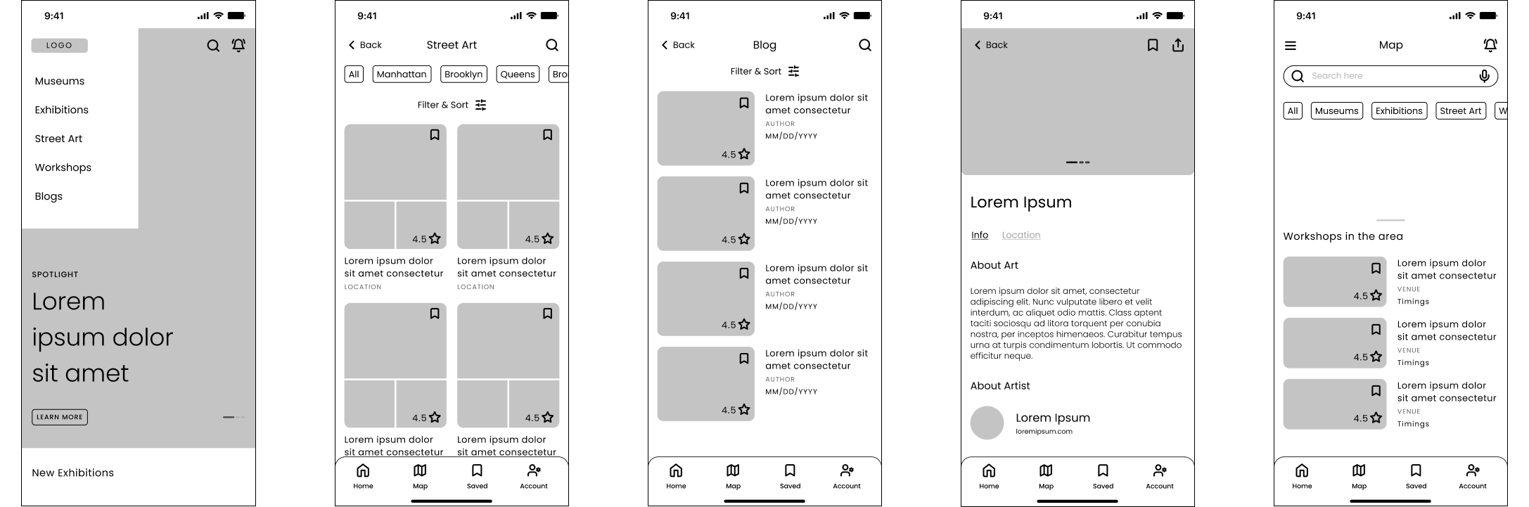
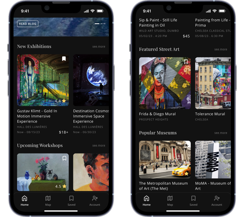
In the final designs, I included onboarding screens, a home page, and dedicated pages for navigating museums, exhibitions, workshops, and street art, each featuring insider tips. I also integrated a map view feature for location-specific exploration and added blogs to keep users updated with the latest happenings.
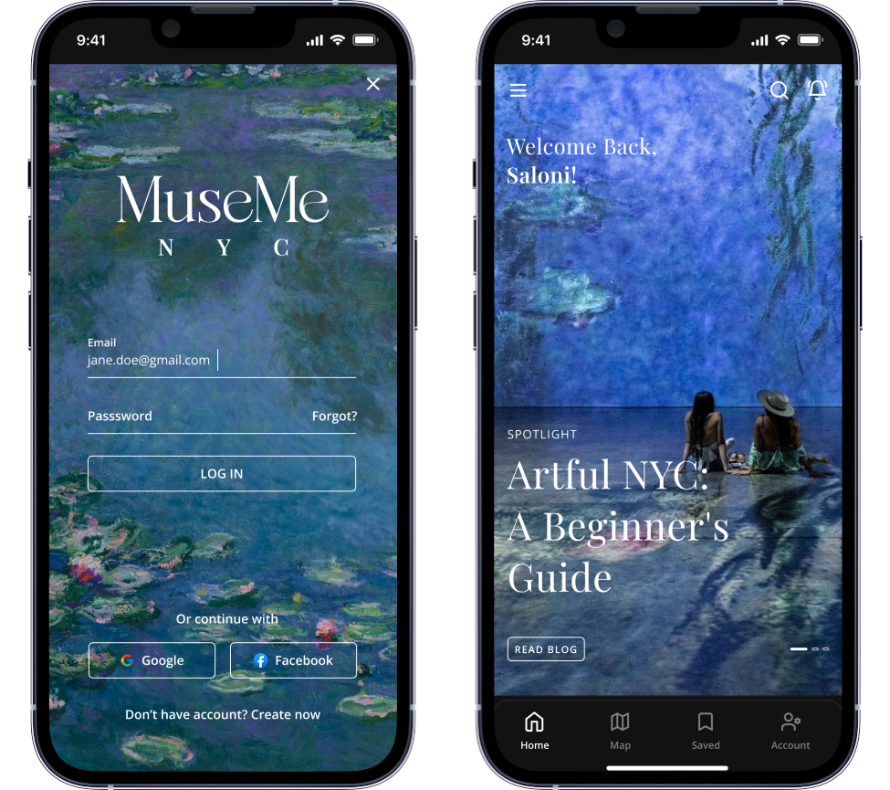
Onboarding &
Home Page
On the homepage, after onboarding, users see a full-screen carousel that spotlights featured content with slide animations.
A hamburger menu provides direct access to pages exploring museums, exhibitions, workshops, street art, and blogs.
As users scroll down, they find sections of upcoming or popular art experiences across these categories.
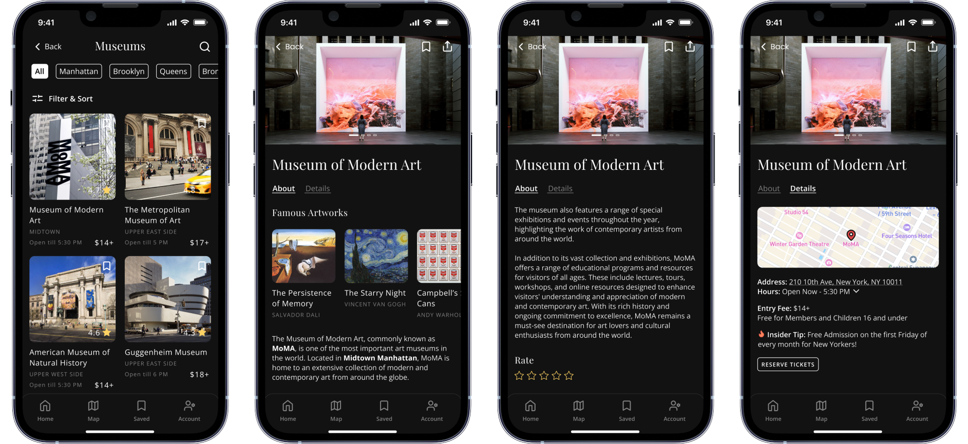
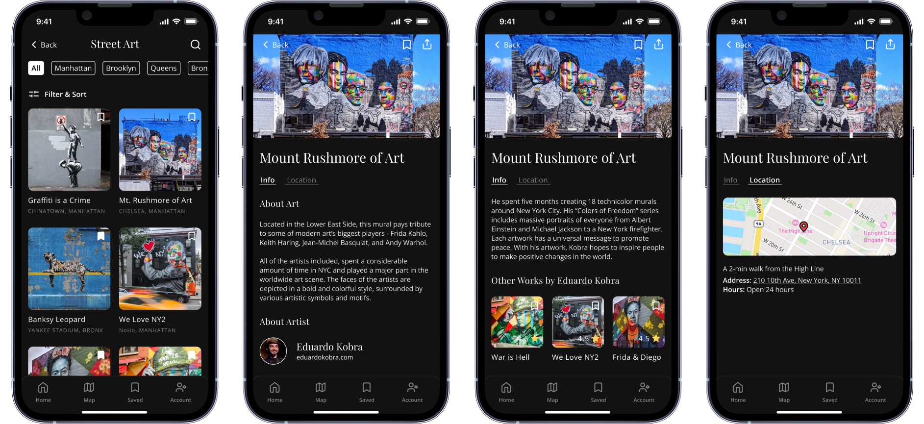
Exploring Museums & Street Art
The main pages have a tile view. Users can filter by location, date, time, knowledge level, budget, and category (modern, renaissance, etc). Each museum has its own page displaying general info, carousel of famous artworks, details about location, entry fees and insider tips. Similarly, Street Art pages display artist information and other artworks by the same artist.
Map &
Saved Items
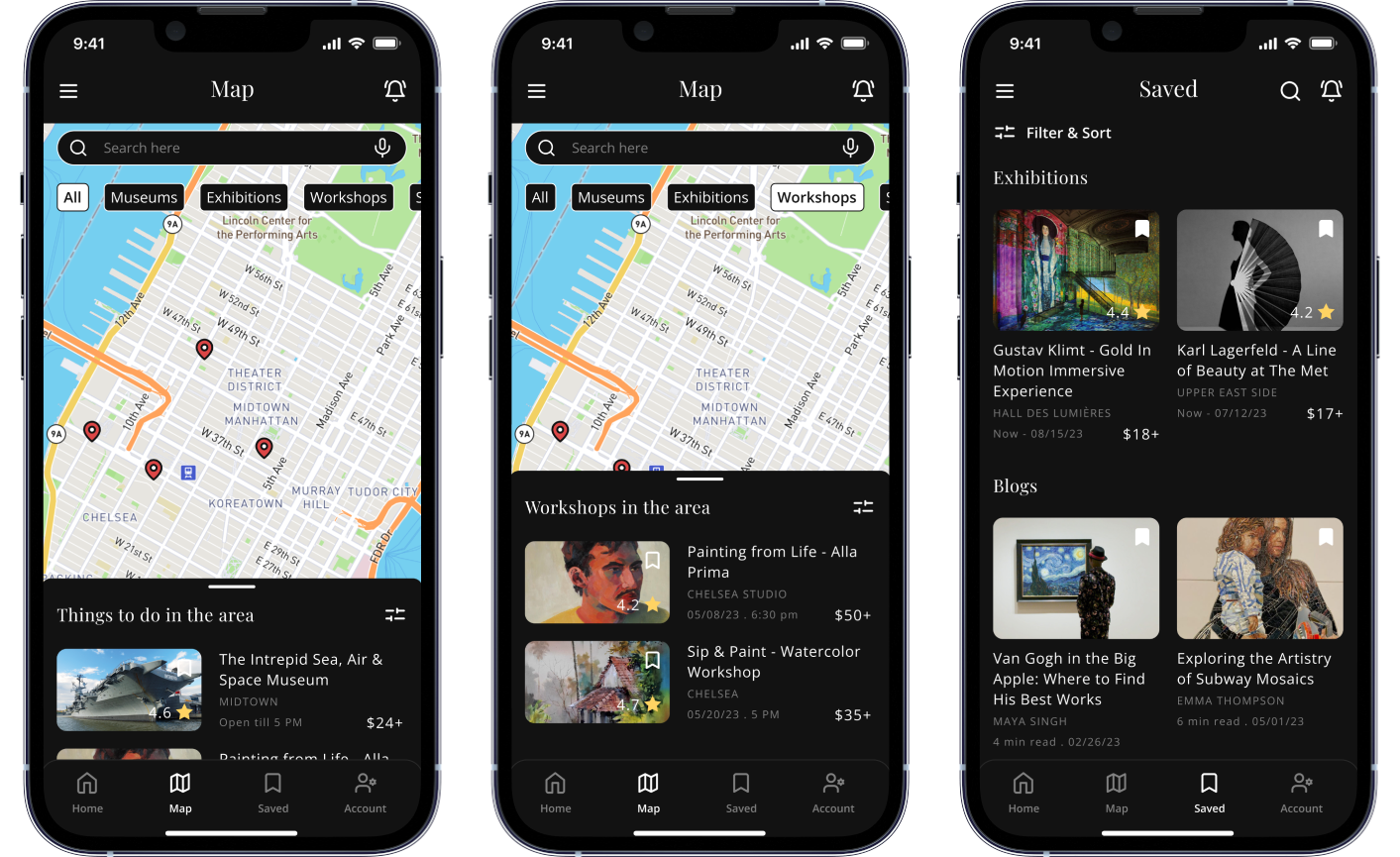
Through the bottom navigation bar, users can access all saved content and an interactive map.
The map displays location pins for art-related things to do in the area, which can be filtered as per preferences.

Blog &
Notifications
Via the hamburger menu on the home page, users can access a dedicated page for blogs covering topics related to art history, current trends, reviews, and more.
Users also receive notifications about time-sensitive insider information and new content added to the app.
Post Project Musings
Working solo was both challenging and rewarding. With tight deadlines and no design team to bounce ideas off of, I had to be self-motivated, make swift decisions, and keep moving forward.
What I would have done differently..
I should have conducted the first round of usability studies after completing the mid-fidelity wireframes to gather early feedback.
Next Steps
-
Incorporate multilingual support to better serve NYC's global audience.
-
Add features for sharing content on social media to promote community engagement.
-
Begin usability testing to gather feedback and refine the app's user experience.