

Overview
Le15 Patisserie is voted among the best bakeries in Mumbai, India. Time-bound working adults, students, and elderly locals are frustrated with waiting in line to receive their orders on time from this famous bakery.
Role: UX Designer & Researcher (solo)
Duration: 1 month (Dec 2021)
Tools: Figma, Procreate, Google Docs, Google Forms
Outcome
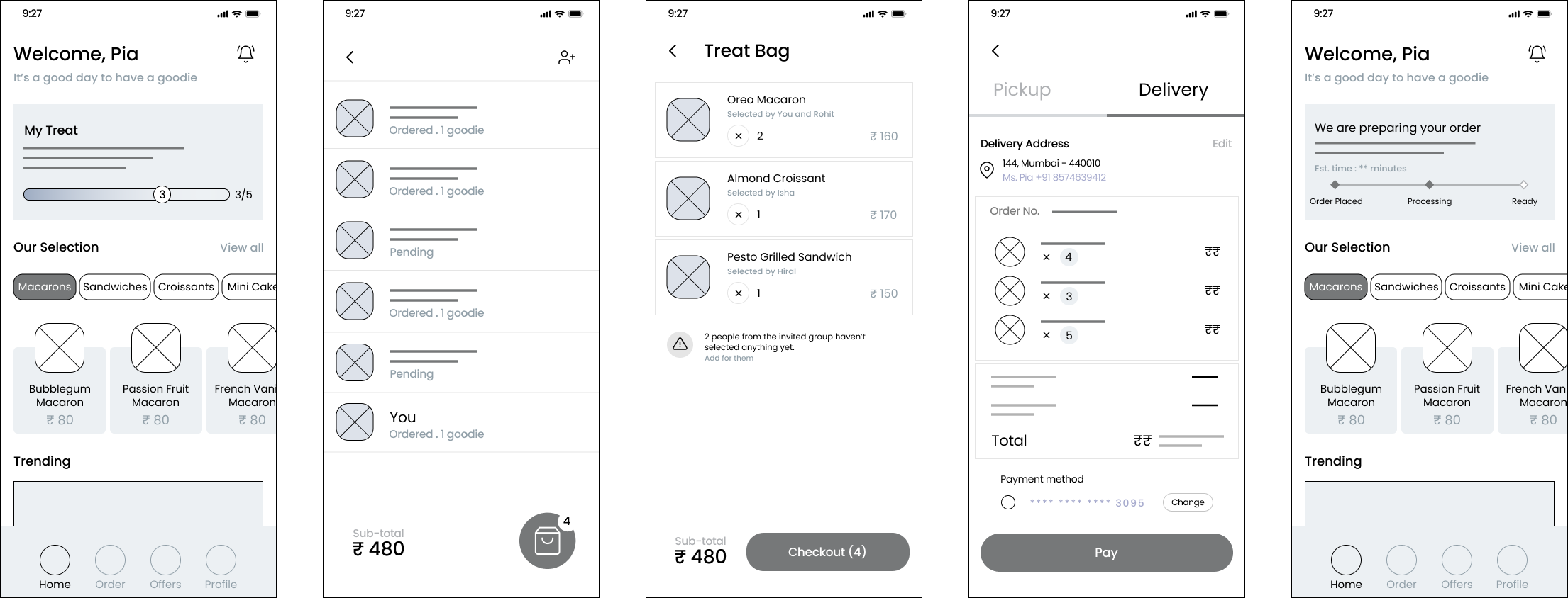
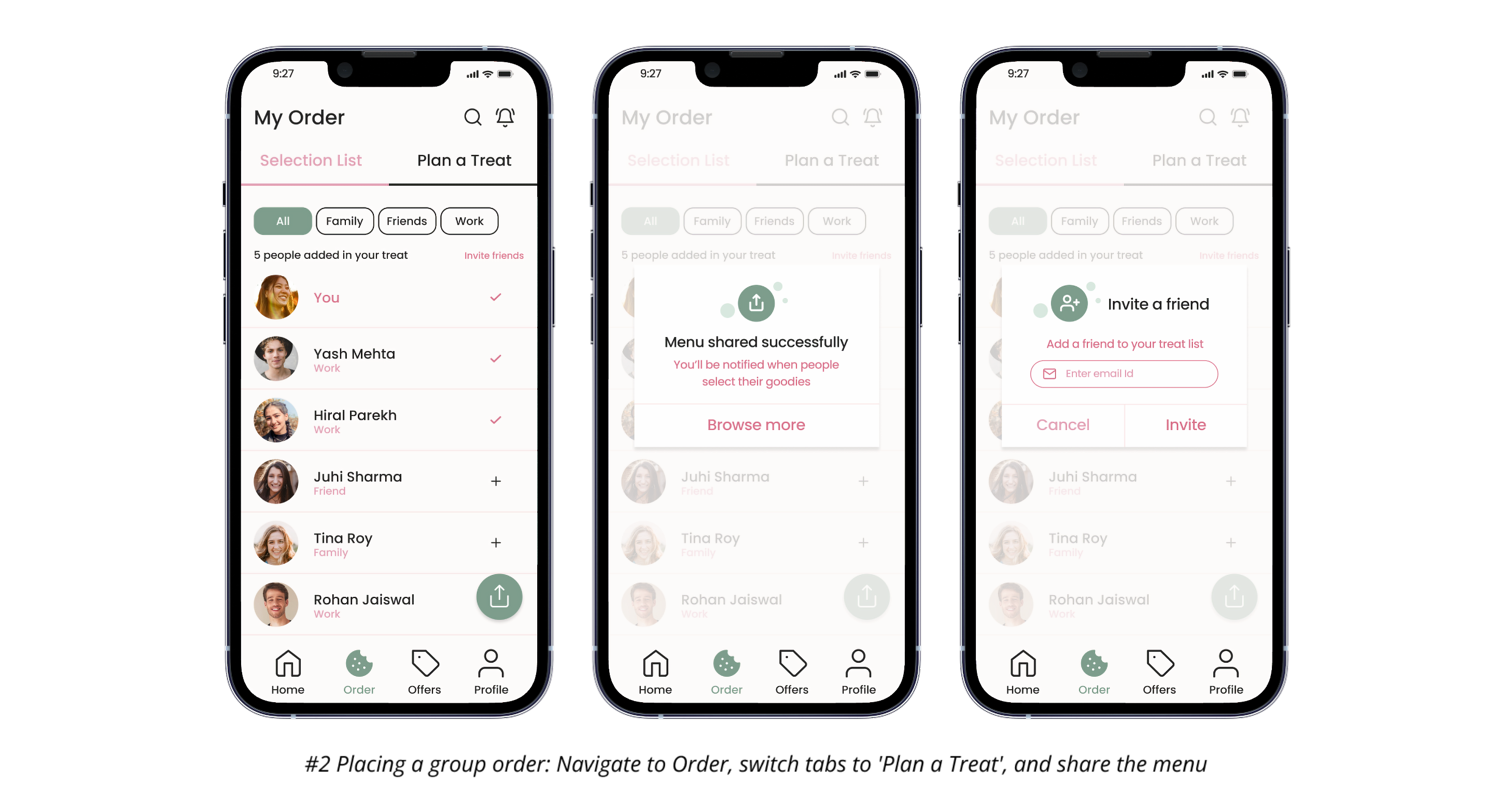
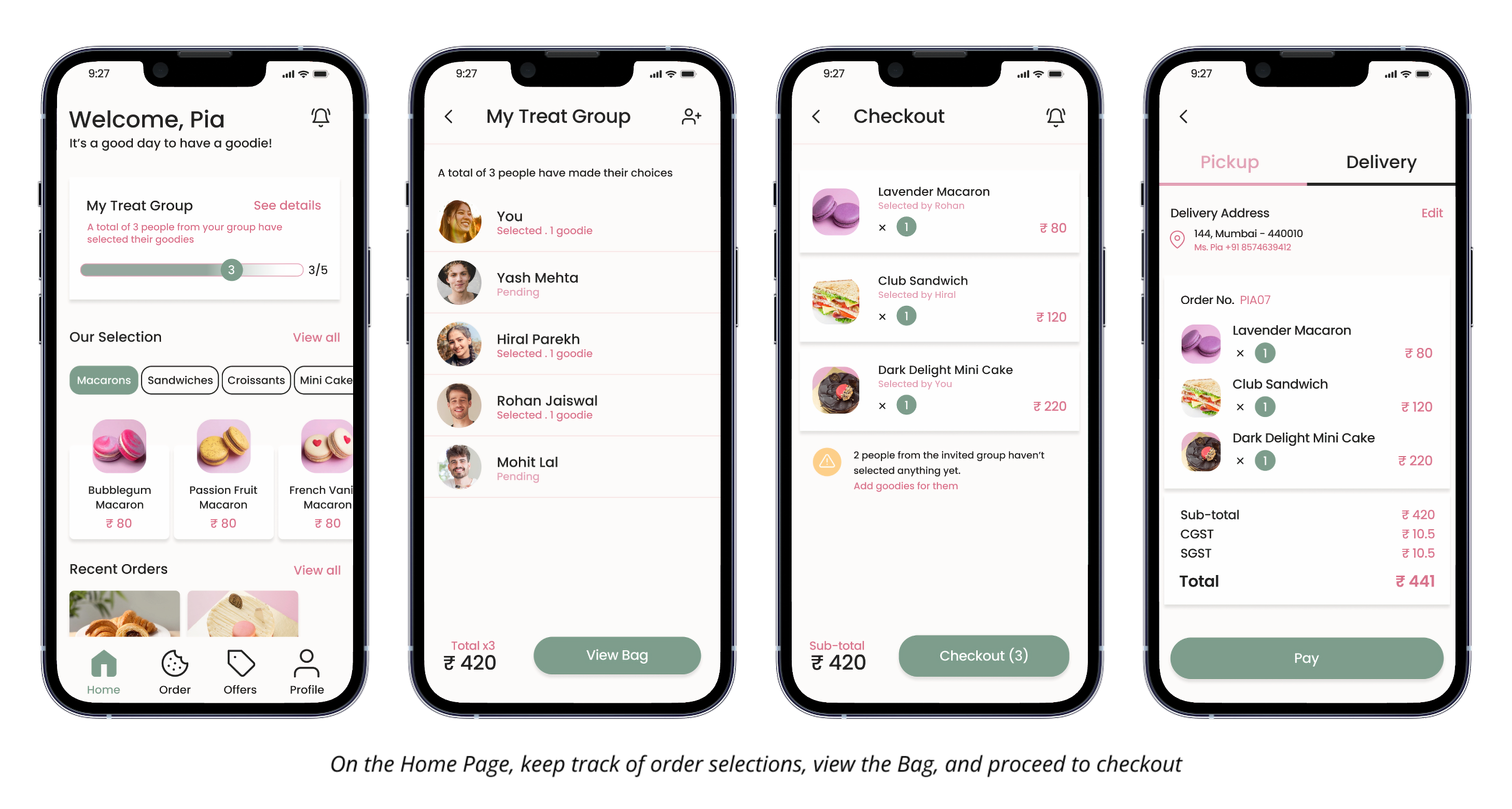
I designed a mobile app for online bakery ordering with a feature that allows users to treat friends and family to their chosen items by sharing the menu and placing group orders.
For this project, I did user research, created a persona, its journey map, a storyboard of key interactions, designed paper & digital wireframes, conducted usability tests, made a style guide, and built a high fidelity prototype.
PROCESS
User Research
I conducted 3 interviews and an online survey.
The research findings showed that busy working adults were the primary user group. They wanted to use their break time for rest and enjoyment of bakery items without visiting the store physically. They were also keen on information about special promotions, safety measures, and item quality.
Working individuals struggle to find time to cook meals and ordering food in-store can consume a big portion of their break time.
Waiting in a queue to order bakery items can pose accessibility challenges for individuals with disabilities and the elderly.
Due to the Covid-19, it's become unsafe to go out and buy bakery items. Users seek a solution to addresses their safety concerns.
Bakery products have a short lifespan, so users always require fresh items quickly.
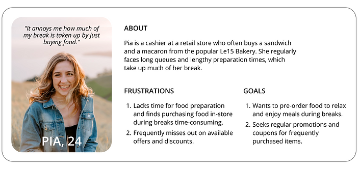
User Persona
Using the above findings,
I created a persona to empathize with the target user group and mapped its journey.

Storyboard
To visualize how a potential group order feature could relieve Pia's frustrations, I drew a storyboard.

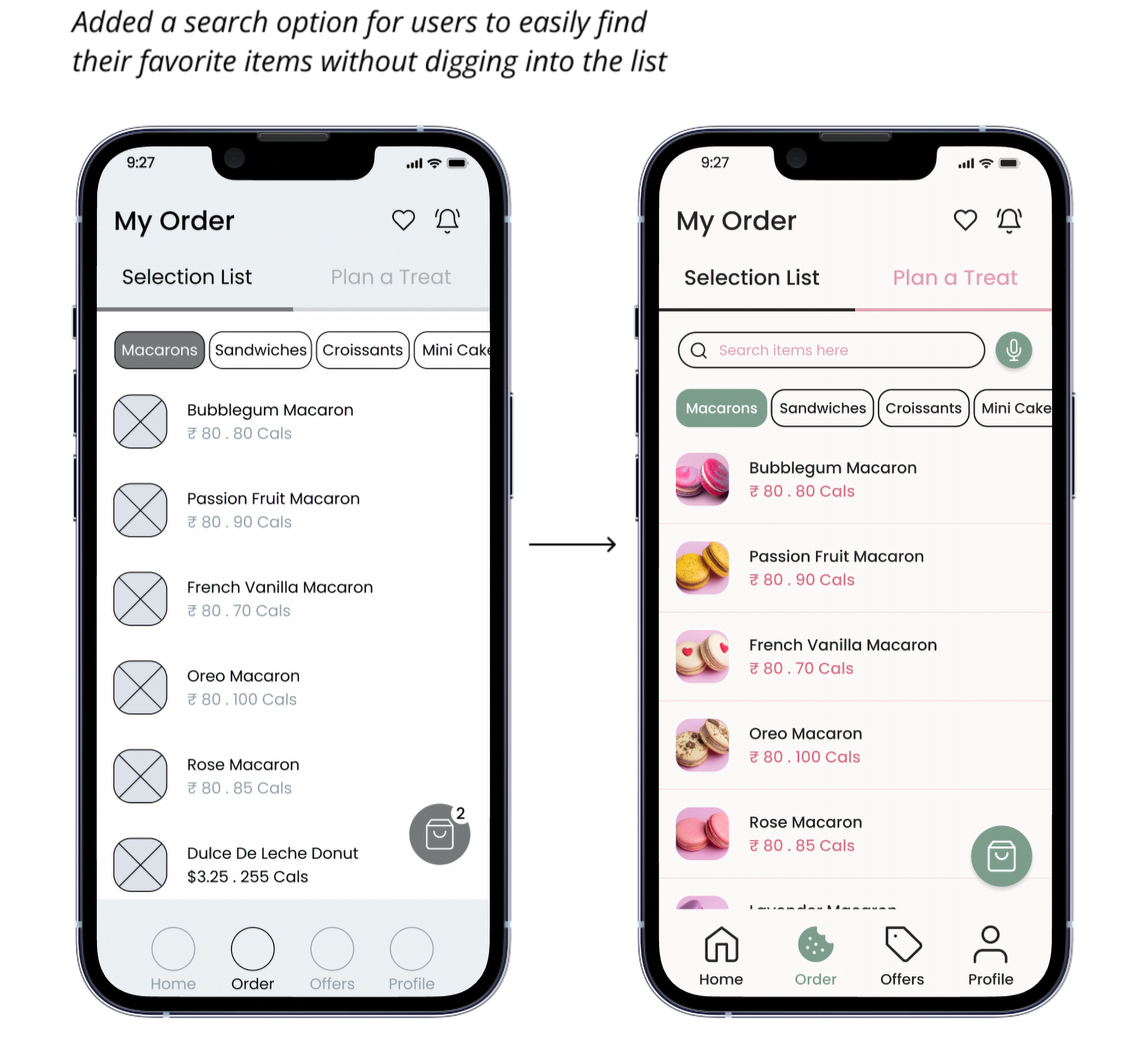
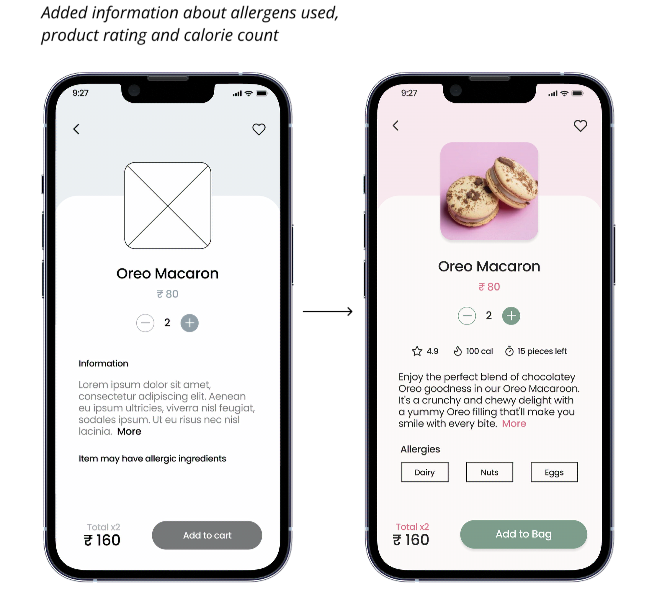
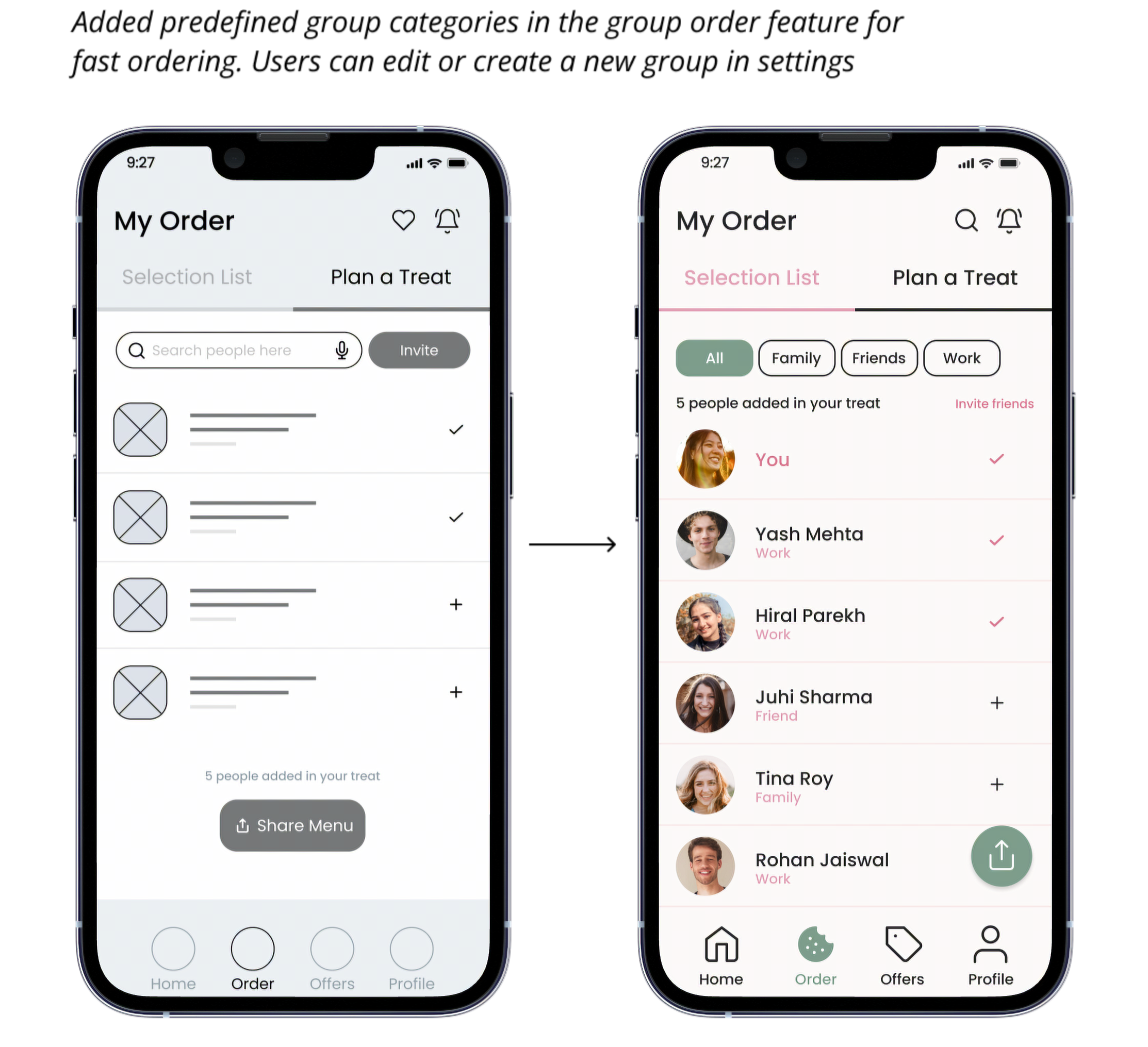
Paper & Mid-Fidelity Wireframes
I then sketched out a structure on paper, digitized it and added details. Stars represent the sections used in the initial version of the Home screen.

Before
After
Usability Studies
I conducted 2 rounds of usability studies: the first using mid-fidelity wireframes and the second using a high-fidelity prototype, which uncovered a few additional areas needing refinement.
Style Guide
Next, I defined the visual elements - typography, color palette, iconography, & UI components.

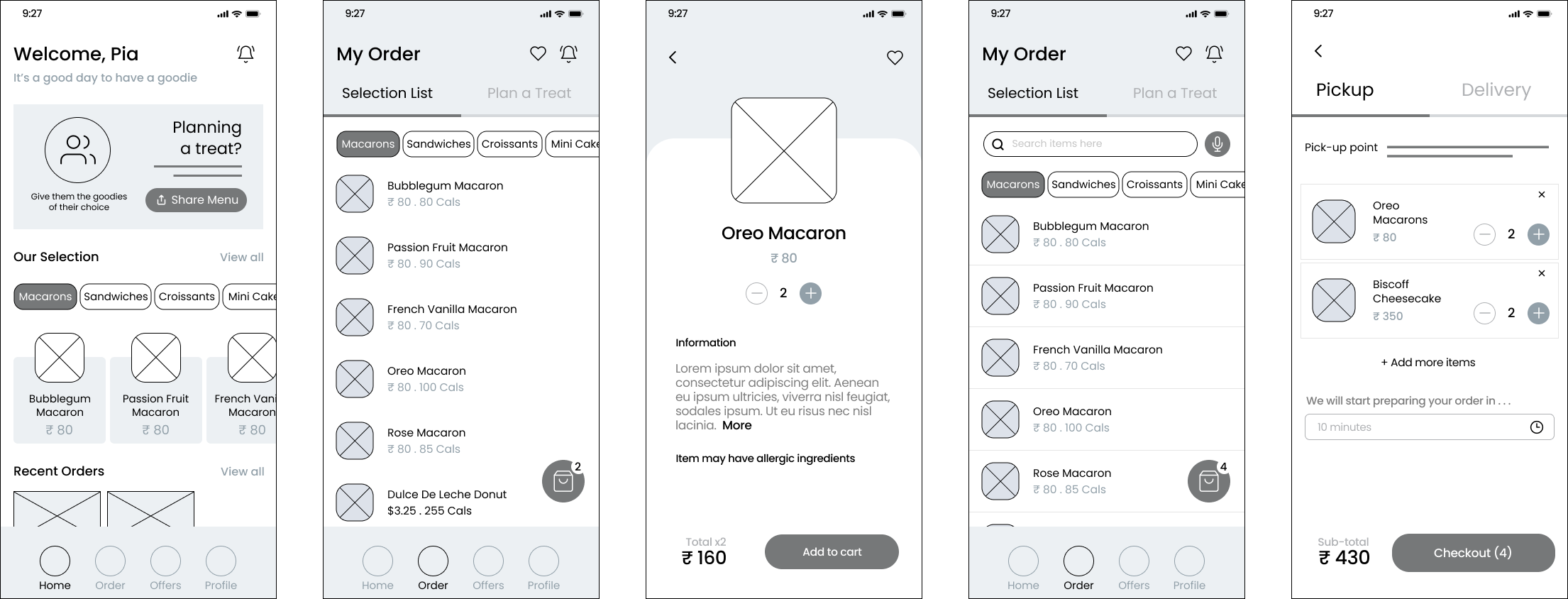
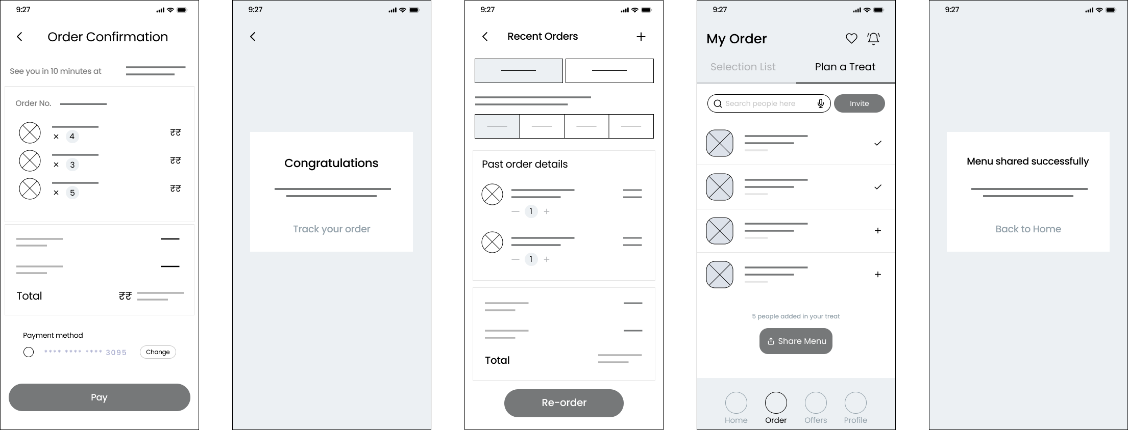
FINAL DESIGNS
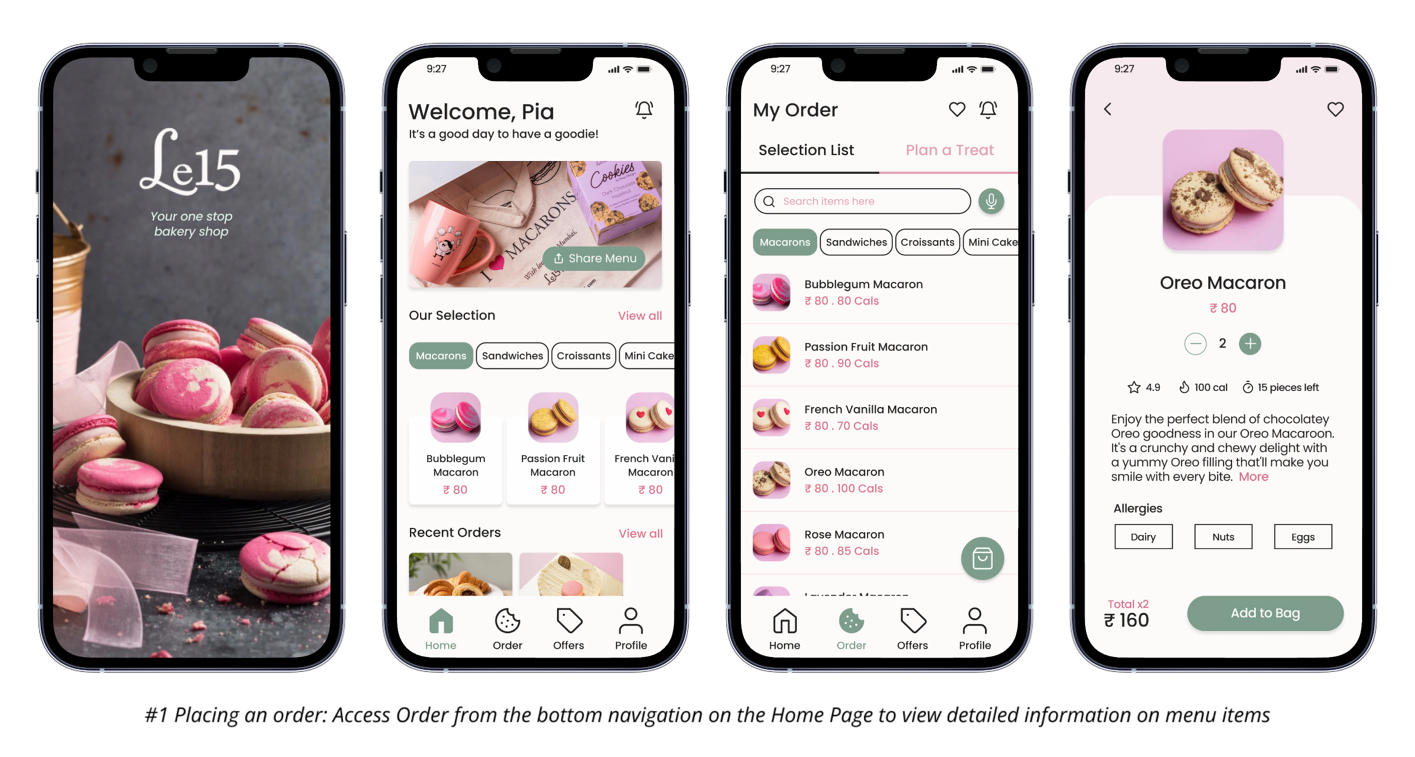
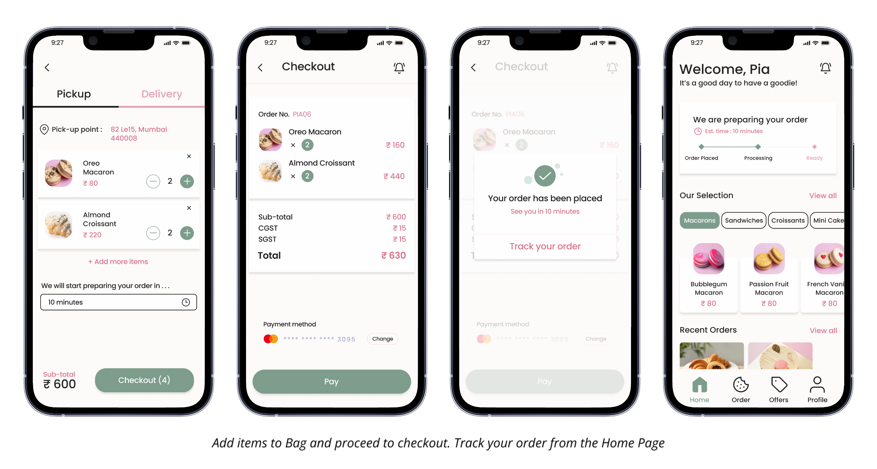
Le15 Bakery App - Key Features
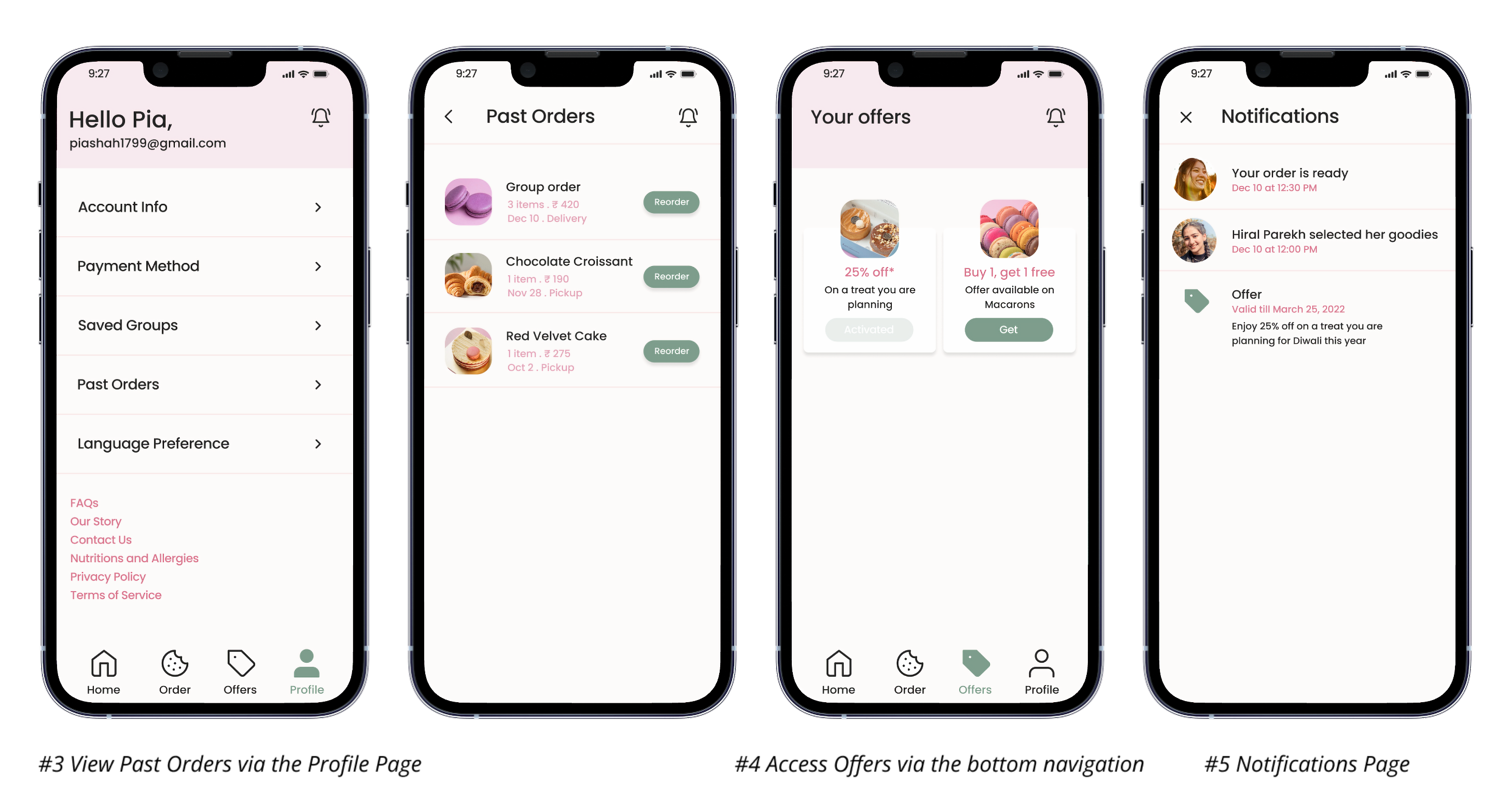
I designed complete user journeys, which included the home page, pages for the order section with group order functionality under 'Plan a Treat,' menu item details, bag, checkout, payment and confirmation, past orders accessible via the profile, notifications, and available offers.
Learnings
Initially, I assumed there to be a single issue, which turned out to be multiple after interviewing customers.
But journey mapping was the star of my research, helping me gain the most empathy and insights.
What I would have done differently..
I overlooked adherence to accessibility guidelines, particularly regarding the color scheme, which may not meet WCAG standards. In the future, I'll prioritize redesigning to ensure inclusivity.